Paul has been talking about making the flash project larger so that the detail is more recognizable. This is a good idea, and to also make it square (there is a lot of empty space at the moment).
This will be the last change to the project.
EDIT-
However, I have just tried to do this but for some reason, half of the button cease to work once transferred. Also the clock isn't disappearing like it used to. This has really buggered everything up. Will try to fix.
EDIT-
No go, it doesnt seem to want to work, without redoing the whole thing again in the new size. Therefore I will just keep it at the same size it was before. Its much more important that it works rather than it looks slightly better but doesn't work.
Tuesday, 27 September 2011
Sunday, 25 September 2011
Last moment touches:
Now that everything is working (I say working, not done, as there are some things to touch up), I thought I would blog some of the things I have changed since last time.
I've now made it so that you can go from a frame (with one info window up) to either the frame with two windows or the frame with the text info, which I have dubbed the reverse text demon window, for all the problems its caused. This has not only added more interactivity, it makes it not so boring and one dimensional. Happy Days.
Now to get those buttons to stop being off by a few pixels...
Thursday, 22 September 2011
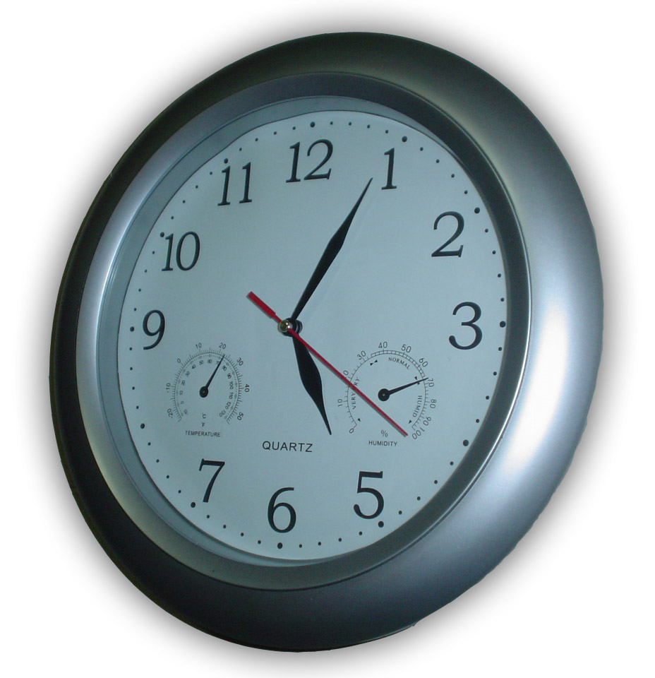
Another problem I am having is the lines that make up the clock. They are way too thin and therefore once they are angled are become near invisible. Will have a play around, or more likely, ask the tutors how to fix!
EDIT-
Problem solved, Paul showed me how to make the lines thicker, and now they look proper, even when angled.
Some design problems with the different icons, The lightbulb one hardly looks like a lightbulb from a distance once drawn on flash. I have redone it to look like a generic bulb more and included very cheesy flash lines. Although they are cheesy, they do make the symbol much more recognizable, which is the overall goal of the icon in the first place.
Now I seem to be having some problems with the buttons. They don't seem to want to work at all. There must be something wrong with the code.
EDIT-
I wasn't telling the buttons to actually do anything in the actionScript. Seems to be a pretty obvious reason to why they didn't work. Fixed now.
In other news, the info windows are all done, with words and everything.
Now to make them all interact together.
EDIT-
I wasn't telling the buttons to actually do anything in the actionScript. Seems to be a pretty obvious reason to why they didn't work. Fixed now.
In other news, the info windows are all done, with words and everything.
Now to make them all interact together.
Monday, 19 September 2011
What interactions should the flash application have?
So far I have the user able to begin the clock and monitor and read one hours worth of info.
I should now be able to get a second info window up at the same time in the same manner as described before.
Also users should be able to switch between the written and picture based info. A little button in the corner, like a book tab would work, or a button like a little info symbol. Might be a little to distracting. We only want people to read the numbers if they want to, I am trying to not force their attention to the numbers.
Wednesday, 14 September 2011
Colors
Thinking about the colors for the interface.
-obviously the green-yellow-red transitions should stay the way they are but the rest needs work
-the outside ring, and therefore the clock should probably not be white, grey would be a better choice as its not so bright. The main attraction to the interface should be the energy monitor and a bright white outline might detract from that. Muted grey would fix this problem. Whilst being noticeable wouldn't be too bright to offset the monitor.
-the info panels should be brown, but a light brown for a different reason. They need to stand out a little more than the clock/outside ring. They should be light enough for visual stimulance but not bright enough to interfere with the images on top, they are much more important, and should be easily read from a distance.
-Text should be black to keep things simple, easy to read and without introducing anymore colors to the palette.
Tuesday, 13 September 2011
Today I had the idea to be able to compare two hours next to each other.
They should be able to both be seen rather than switching between the two.
The solution to this is if one is open and another is clicked then to move the current one to the side and show the new one side by side with the other one.
Problem solved, and a nice little addition to the interface, making it more information and interactive,
Sunday, 11 September 2011

Project 2a Written Description
One of the major problems with energy meters is that they aren't often checked. Ones online are only checked when the user can be bothered and when energy ratings are not being checked then no change can be noticed or made.
My idea for my energy monitoring interface is to combine the interface with a clock. This way people will constantly be checking their energy rating without really noticing or needed to go out of their way to do so. My product will be designed for a middle class western home owner but essentially anyone will be able to benefit from it. Because I want my design to be a easy to read at a glance I will use bright easy to recognize colors such as green and red for good and bad respectively. Also using easy to notice symbols such as arrows to show information will help people gauge as much information as possible whilst minimizing the need for numbers and settings.
The overall design is to have a circular meter which will move around in a clockwise manner from the bottom. Users will be able to set either a 'average' setting or try to lower their average energy use by a set amount (10% for example). As the day progresses the meter will increase around as it heads towards 100% of their goal. Each hour the meter will mark a line and divide the meter into segments. Users will be able to click on (using touchscreen technology) each segment to receive some information about the hour they are selecting. At first they will be able to see if, for that hour, they have used too much or less than the average energy. This will be shown by an arrow varying in size and color. They will also be able to see what area (out of water, heating, appliances and lighting) they are using the most energy, with easy to recognize symbols.
My design will not only be easy to use but it will be more accessible than a website or a power meter. People will naturally check their energy use when they check the time and therefore will notice if they are wasting energy immediately.
Thursday, 8 September 2011
Development progress
After talking to my tutor at the tutorial today I have changed some things.
There will be only one 'mode': the original percentage bar that goes around the outside.
However, this time it will mark little time intervals at each hour. This will keep track of how you are doing not only per hour but during the day.
You will also be able to click on each time interval to review the information as planned in the time clock interface before.
This neatly combines bothe ideas and displays them in a handy easy to read on glance way.
Wednesday, 7 September 2011
Color choices
Although I want to keep my interface as gender and age free as possible (the color should be able to be changed) the main interface will generally be black with colored areas. The clock (or hands is analog) will be in a contrasting white and the energy readings will be in green-red spectrum.
The black helps make the colors stand out and easily readable at a glance.
The black helps make the colors stand out and easily readable at a glance.
The look of my interface has changed from a square to a circle to tie in with the clock feel.
Not only does this make more sense visually but it also reduces the pointless space wasted in the corners.
From a practical viewpoint this not only cuts back on resources needed for making it but also improves the overall aesthetics when placed in a modern home. (which is typically quite square and measured)
Tuesday, 6 September 2011
Specific examples
Most people have let me know that they want to know what is using the bulk of their energy.
As well as giving some numbers (only if they want to see them, the main thing for the interface is to be as numberless as possible), the interface can let you know the main areas of energy use per day or per hour.
This will let them know where they need to cut back on.
As well as giving some numbers (only if they want to see them, the main thing for the interface is to be as numberless as possible), the interface can let you know the main areas of energy use per day or per hour.
This will let them know where they need to cut back on.
Functions
Some functions are needed for my 'clock' interface.
Users should be able to see the rate of their energy use against their average.
I plan to do this with a circular percentage bar thing. It will progress around the outside of the clock against the users average energy use. As it reaches 100% it will turn more red and at 100%> the whole outside of the clock will be red. This will let users know at a glance how they are doing against their energy use.
Apart from just the percentage rating I want to show people the times during the day they are using the most energy. Theres not much point telling someone that at 4 am they are on track if they use most of their energy after 5pm for example. therefore a second interface option would be to show each individual hour against the average for that hour alone.
Monday, 5 September 2011
Target Audience
What will the target audience be for my interface?
The western world is the greatest user of power compared to the eastern/middle east per capital.
They also are the people most likely to be able to change their energy use.
Since I am focusing on the household my target age would probably be home owners but anyone who is interested in reducing their power could use it. It wouldn't be complex so that anyone could be able to use it.
The interface would be unisex but maybe having different color choices could appeal to a wider market.
Some interface research.
I asked a few people this question:
If you had an energy monitoring application on your phone or ipad etc. what kind of information would you like it to show besides your overall power usage?
to find out what some of my target audience would like and here are their responces:
-what elements of use use the most power, probably in receding order from most to least and maybe options of turning off certain applications that are using power unnecessarily?
- It'd be cool if it displayed power used in terms other then watts volts joules whatever. If it told me the power my phone was using in terms of a Big Mac that would be cool, as in "my phones running through a 3 Big Macs a month since I started playing angry birds".
- It'd be cool if it displayed power used in terms other then watts volts joules whatever. If it told me the power my phone was using in terms of a Big Mac that would be cool, as in "my phones running through a 3 Big Macs a month since I started playing angry birds".
- If you could scroll down your list of application and 'flick' the apps that are sucking power into a dormant mode area where they're turned off. It'd also be good to see how much power is being used by 'dormant' but active things, like applications that auto sync on a regular basis.
-if the phone could hold information about nominated applications for the month which could be downloaded. Info such as usage duration//cost & diff in cost if application had been used at a different time (peak/off peak etc).
From this I've noticed that people don't want to be told useless numbers and facts. Also that people want to be able to control their power rather than just know what is currently happening.
Sunday, 4 September 2011
More development
One thing that interests me is the availability of information. In the lecture we were told that people who check their bank account regularly will ultimately use less money as they notice the steady increase in their spending. However if you never saw your bank account you would have no idea if you were spending too much.
I would like to take this into the energy field. The current problem is the lack of current updates on our power usage. If we were to constantly see it we might actually change something.
My plan is to combine a clock with my energy interface so that the user will be checking their power usage regularly in their home without needing to go out of their way to do so.
Subscribe to:
Comments (Atom)